ArcGIS Visualization
This tutorial will introduce using ArcGIS Pro and ArcGIS Online as a geospatial data visualization tool.
Setup Instructions
In preparation for this tutorial, you will need an organizational account with Esri. If you are a Brock user, you will sign into the software using your Brock credentials and the organization’s URL brock.maps.arcgis.com.
The Scenario
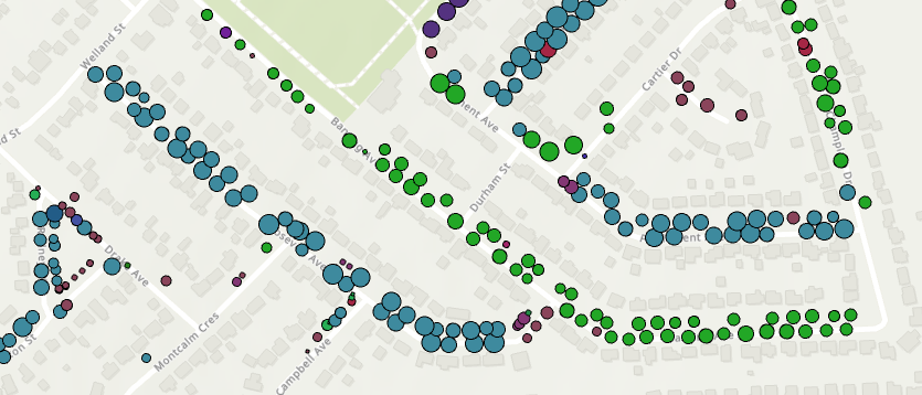
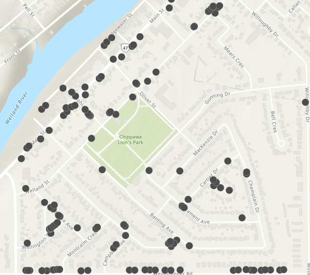
We will be mapping tree sample data for the neighbourhood of Bridgewater near Niagara Falls and Chippawa. Tabular data was joined with the geospatial data creating a powerful connection that will allow us to visualize attributes such as diameter at breast height (DBH) and tree species. Although this example uses point data, the same general steps could apply to boundary files such as census tracts or municipal boundaries and associated tabular data.
Visualization in ArcGIS Pro
Although there are many ways of creating visualizations using GIS technologies, we will explore some simple options using unique colours for species and proportional symbols for Diameter at Breast Height (DBH).
- Run ArcGIS Pro and sign in using the organization’s sign in workflow https://youtu.be/GqH4UHTUf2s
-
In a new map, add the joined layer from the previous exercise. Alternately, download the zipped shapefile here. Be sure to unzip the file before attempting these steps. HINT: Right-click the zip file in Windows File Explorer and select ‘Extract all’.
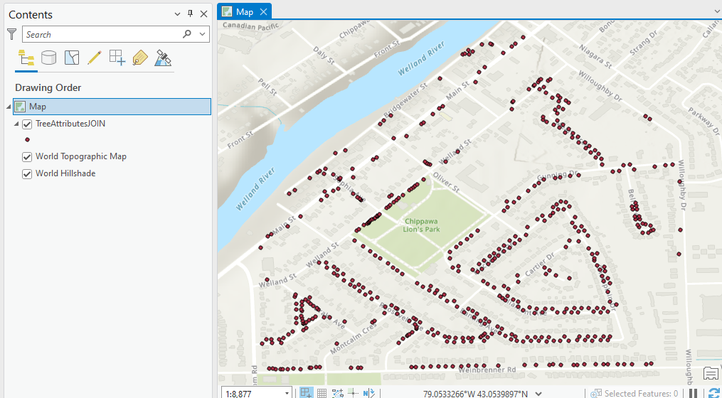
- From the Contents pane on the left side of the map view, double-click map
 to open the map frame properties. It is good practise to set the projection of the map frame to a local coordinate system.
 - From the map properties window, click Coordinate System and enter “UTM” in the search box.
- Double-click **Projected Coordinate System”.
- Double-click UTM then NAD 1983.
- Select NAD 1983 UTM Zone 17N for the Niagara area.
-
Click OK.
- With the layer selected from the Contents listing, click the Feature Layer tab at the top.
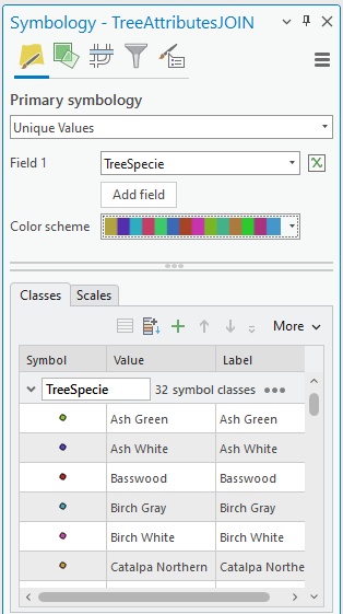
- Click Symbology. The Symbology pane appears to the right of the map view.
- From the Primary Symbology dropdown, select Unique Values and select Field1 -> Tree Species
- Select a colour scheme from the dropdown.
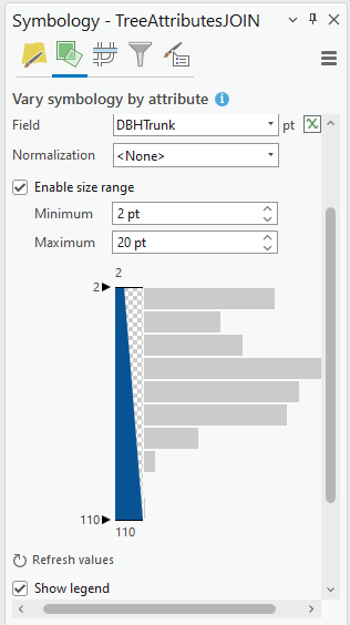
- To vary symbology by size as well as colour, click
 from the Symbology pane.
 - Click Size and select DBHTrunk from the field dropdown.
- Check the box to Enable size range and adjust the range to be 2 at minimum and 20 at maximum.
- Scroll down and select Show Legend.
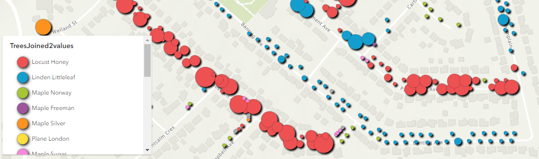
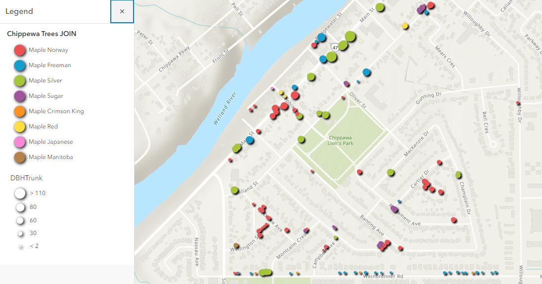
The trees are now symbolized by colour for tree species and size for diameter at breast height (DBH).
Saving and Sharing
- From the Contents listing, right-click the tree layer.
- From the context menu, select Sharing > Share as a layer package. A layer package includes the assigned symbology and layer data your colleagues might need to work with the data effectively.
- Under Start Packaging choose Save package to file (alternately, you could upload the package to ArcGIS Online).
- Under Item Details select a location and file name; summary and tags.
-
Under Options check the box to Include Enterprise and UNC Path Data. This option tells the software to include the data layers with the package.
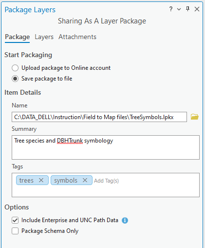
- At the bottom of the the pane, click Analyze to see if there are any problems and then click Package.
- Open Windows File Explorer and navigate to the location where you saved the file

This .lpkx can be shared with colleagues who are also using ArcGIS Pro.
NOTE: To use a .lpkx file, simply drag and drop the file to the map view from the Catalog pane.
Visualization in ArcGIS Online
In some respects, visualization in ArcGIS Online offers more options and simpler workflows.
- Go to https://arcgis.com and sign in to your ArcGIS Organization, brock.maps.arcgis.com > Brock university (when prompted with the Brock authentication page, enter your Brock credentials).
- Click Map at the top of the screen.
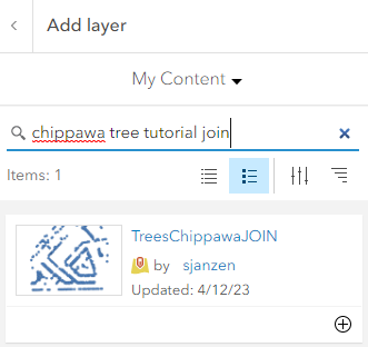
- Click Add and change the folder from My Content to ArcGIS Online.
-
Enter the keywords “Chippawa tree JOIN tutorial” and click the plus sign to add the layer to your map.
- Click the back arrow to return to the layer listing
Applying a Filter
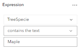
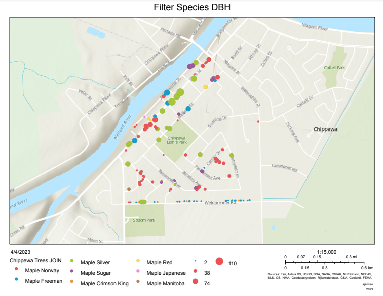
To start off, we will filter out the species of trees that include ‘maple’ in the species description.
- Click the Filter tool from the right side menu
 . The Filter dialogue box appears.
 -
Click

-
From the dropdown options, create the following expression:
-
Click Save.
The map now shows all trees that contain the word ‘Maple’ in the species description. (NOTE: use a capital “M” in “Maple”)
Symbols
- Click the Styles button
 from the menu to the right.
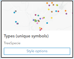
 - In the Styles pane, make the following selections:
- From Step One, click
 then select the field to map, in this case, select TreeSpecies.
 - Click
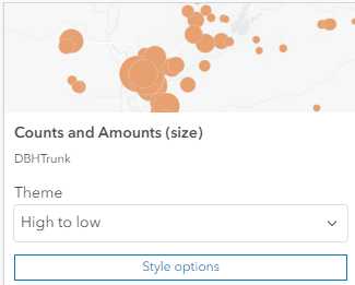
 again and select DBHTrunk. The symbols are updated with colours representing species and proportional symbols representing diameter.
 - From Step 2 of the Styles pane, Pick a Style, select Style Options for types and size. There will be 2 options: one for unique symbols and one for counts and amounts.
-
Click style options for unique symbols.
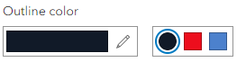
- Click the colour ramp for symbol style.
-
For Outline Colour, select the black option.
-
Click Done then click the Counts and Amounts style options.
-
Scroll, if necessary, and change the upper size range to 20.
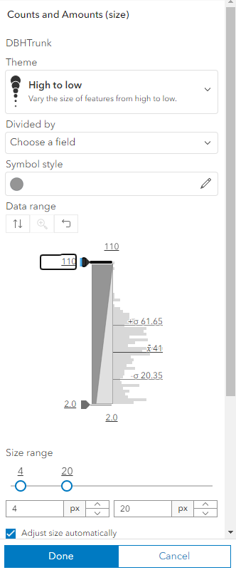
- Click Done twice.
- To give the map a little ‘pop’, click the effects options
 .
. -
Toggle on the Drop Shadow option.
Save and Export
- Click the Save button from the left hand menu and save the map with a unique name.
- To share your map as an image, click
 .
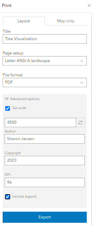
. - Click Advanced Options and enter a title, set scale (~15,000), author, copyright and check the box to include a legend.
-
Click Export. When the file is complete there will be a link to your file below the Export button.
Next Steps (Optional)
ArcGIS Pro: Layout, Sharing, Printing
This tutorial is supported by the Brock University Research Lifecycle Department, Map, Data & GIS Library. If you have any questions or concerns regarding this tutorial, don’t hesitate to contact maplib@brocku.ca