With the start of 2022 we’ve finally come to the point where we need to finish collecting our dataset and now start cleaning it up and analyzing it. One of our primary research goals is to see how different municipalities in the Niagara Region communicated COVID information on their webpages during the unfolding crisis. This of course is made possible by the wonderful dataset we are creating.

Enter Google Colab
Google Collabratory is Google’s answer to the Jupyter/IPython notebook. In short it is platform that allows you to create a webpage with embedded code snippets. Since it is build on Google infrastructure it ties in very nicely with Google Accounts, and it offers a Pro option that allows you to tap into more computing power. The great thing about Colab is that you don’t need to install any software on your local machine and sharing your results is as simple as collaborating on a Google Doc. One final thing worth pointing you is that you can save itertions of your notebooks directly to GitHub so they are even more accessible to the web. The Digital Scholarship Lab is a huge fan of sharing everything (data, teaching material, workshops) via GitHub.
Preliminary Results
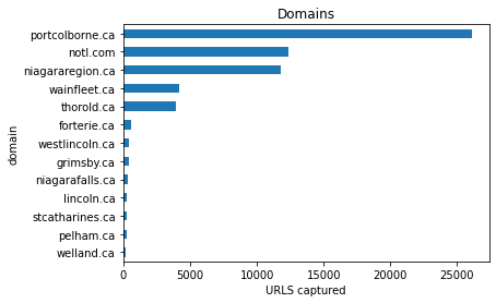
As mentioned we decided that we would collect our web archive until end of December 2021 so that when we returned for the new year we’d turn our attention to scafolding up our analysis tools. To start with we restricted our dataset to the 14 municipalities in the Niagara regions. Here’s a graph showing how many URLS were captured.

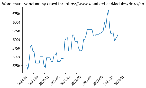
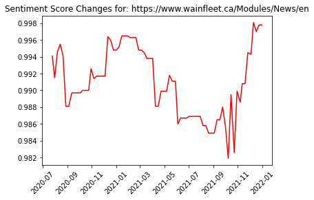
Once we narrow down to a city we can drill down even farther to see the details about urls that were harvested. We even calculated some additional metrics on our full-text content:
- Page Length, simply is the number of characters that are in the full-text. When you notice a change to this number that means that content has been added or removed from the page.
- Sentiment Score, this is a fascinating measure that attempts to quantify the sentiment, or mood expressed, on the page. Specifically we are using the VADER sentiment analysis tool.
Plotting these two values for URL captures in the dataset is very satisfying.


Try it yourself
To no surprise, we have shared the notebook on our Github repository for this project.
If you add it directly to your own Colab account you render any of the 14 municipalities data. The notebook offers a download of a constructed CSV file of your dataset. Just follow the badge link to begin: